Form Layouts
Form Layouts allow system administrators to define different cosmetic designs for forms within Deacom. An example of a form is the Sales Order Entry form under the Sales menu. In the same sense that Grid Layouts allow end users to change the columns on a grid and Report Layouts allow users full control over the output of printed Reports and Part Forms, Form Layouts allow users to fine tune the work flows within each form in the system. Form Layouts can be modified and set for All Users, a User Group, or a Specific User. When a user-defined form layout is opened in the system, the word "User" will be displayed in parentheses next to the form name. See the Configuring Form Layouts page for details on creating and using Form Layouts in Deacom. The "Toolbar -- Edit Form Layouts" security setting controls access to this feature. The use of the Layout functionality when editing user-define fields allows the user to break user fields onto different tabs by groups, and greatly increase the operators efficiency during entry.
Notes:
System Navigation
- System > Maintenance > Form Layouts
- The "Layout" button via any form throughout the system.
Forms
Every Window in Deacom has an associated form layout. When you navigate to System > Maintenance > Form Layouts, you will see a list of user-defined form layouts in this instance of Deacom. IF there is nothing here, then all the forms used are the system forms. The easiest way to figure out what form you want to edit is to click on the "Layout" button on the form you are on. This will bring you immediately to the Form Layout Editor for this form. If you want to add another copy of a given form layout you will want to click 'New' to add a new form layout to the list.
Please be aware that several forms in Deacom are "utility" form layouts and appear throughout the system. MainMain is a perfect example of one of these utility form layouts. If you modify this layout for a specific purpose, the modifications will appear everywhere this form is used. MainMain is used on most of the Maintenance menu options. To make additions to a utility form layout that are specific to a specific instance of the utility layout will require scripting.
|
Button |
Description |
|---|---|
|
New |
Allows you to add a new Form layout to your list of user-defined forms. When clicked, a search box opens to allow you to select the base form layout to use. |
|
Modify |
Allows you to modify the selected form layout by opening the Form Layout Editor. |
|
Display |
Allows you to choose Active, All, or Inactive form layouts to show in the grid. |
|
Layout |
Allows you to Modify this form layout (MainMain). |
|
Activate All |
When viewing your inactive forms, this will bulk activate the inactive forms visible in this list. |
|
Deactivate All |
When viewing active forms, this will bulk deactivate the forms visible in the list. Note: Occasionally a form layout can become corrupted and the only way to inactivate it is to filter the Form Layout grid down to just that form layout and click Deactivate All. |
|
Export All |
When clicked, creates a file for each user form layout in the list. The file(s) will be downloaded to the Windows download folder.
|
Form Layout Editor form
Once launched, the user is presented with a WYSIWYG (What You See Is What You Get) interface conducive to interactive design on the left side of the window. The right side of the window presents header-level options for managing the Form Layout as well as a tree view which can also be used to interact with the objects on the layout. Complete information on setting up and using Form Layouts is available via the Configuring Form Layouts page.
|
Button |
Description |
|---|---|
|
Import |
Allows you to import a Deacom .uform file for this layout from other Deacom systems. |
|
Export |
Ability to export a Form Layout to a .uform file. |
|
Add New |
Depending on which Object selected in the tree allows you to add elements to the object. This is hierarchical and dependent on the object chosen. |
|
Modify |
Allows you to modify the element selected in the tree or in the WYSIWYG editor on the left. |
|
Delete |
Allows you to delete the selected element. Using this button is the only way to delete an element from your form. |
|
Save |
Allows you to save the form layout design you created. Notes:
|
|
Undo |
Undoes any changes made to the form layout. |
|
Field/Flag |
Description |
|---|---|
|
Layout For |
All users, User Group, or Specific User. This option defines what users this form layout will apply to. |
|
User Group |
Contextual search field. Only enabled for Layout For types of “User Group” and “Specific User”. |
|
Device |
Allows you to choose what this form layout is for. All, Desktop, or Mobile. Defaults to All. |
|
Description |
A short description of the purpose of the layout. For instance, “Customer Service – Fast Order Entry”. Note: You should always update your Description each time you alter the form layout. We recommend adding the date modified to your description text. |
|
Active |
Defaults to true, uncheck to make the layout no longer apply. Unchecking this flag and saving will reset the form to the default system version in Deacom. Note: Deacom uses the oldest active form layout when loading the form for the user. If you have two form layouts for the same form and layout for, then the layout with the smallest ID (oldest) will draw on the screen. To use a newer form layout, always inactivate the older form layout to see the new form. |
Object Types
The list below contains the form objects used in Deacom. These objects are intractable in the Form Layout Editor. Object types are pre-determined by Deacom for the specific field you are using. There are options to create unbound custom controls for several of these object types on any grid you would like. They are "unbound" meaning they do not link to a database field and will not be saved/updated by base Deacom. They will require scripting if you want to save the data in these unbound custom controls.
|
Object |
Purpose |
|---|---|
|
Form |
The form itself is the container for all other objects on the form. |
|
Section * |
Sections contain other objects and can either be two columns wide or one column wide. |
|
SectionFrame * |
Section Frames contain Sections, every Section in a Frame becomes a Tab. |
|
ToolBar |
ToolBars contain buttons and are always either at the top of a form or the top of a grid. |
|
ToolBarButton * |
Buttons on the toolbar, such as the "Add" button. |
|
ToolBarSeparator * |
Vertical line separators that allow for separation between groups of buttons. |
|
CheckBox |
Boolean state boxes that are either checked or unchecked, such as "Active". There is also an option for Custom Criteria, which can search for User Defined Fields. |
|
ColorPicker |
A control that allows for selecting a color, such as the Work Flow Color. |
|
ComboBox * |
Also referred to as a "Dropdown" or a "Picklist", allows for selection from a pre-defined group of options. There is also an option for Custom Criteria, which can search for User Defined Fields. |
|
DateBox |
Allows for the selection of a date. There is also an option for Custom Criteria, which can search for User Defined Fields. |
|
FilePicker |
Allows for the selection of a file, such as in View Docs. |
|
FontPicker |
Allows for the selection of font, such as the Grid Font in System Options. |
|
Grid |
Displays data in a row / column format. |
|
MemoBox |
Allows for the entry of data that is multi-line and free-form. |
|
MultiLineTextBox |
Allows for the entry of data that is multi-line and free-form, except without drilling down (such as the send email form). |
|
SignatureBox |
Allows for the recording of a signature, such as in the Point of Sale application. |
|
SearchBox |
Allows for lookups of records for assignment purposes, prevalent on editing forms and pre-filters. There is also an option for Custom Criteria, which can search for User Defined Fields. |
|
TextBox * |
Allows for single line of text entry. |
|
PhoneTextBox |
A variant of the TextBox that allows for quick phone calls in the mobile application. |
|
URLTextBox |
A variant of the TextBox that allows for launching of a URL on click. |
|
TimeBox |
Allows for the recording of time to accompany a date. |
|
Tree |
Shows parent / child relational data, such as on the configurator or the form layout designer itself. |
* Available as a custom control.
^ Available as a custom control starting in 17.04.
Edit Element Form
Properties Tab
-
All elements(objects) have a "Control", "Type", and "Caption" property. The additional properties displayed on the "Edit Element" form vary depending on the element selected. Reference the "Configuring Form Layouts" page for additional information on using the "Edit Element" form.
-
The options in the "Control" also vary depending on where the Edit Element form is being added or modified. For example, when adding a new element for a SectionFrame, the Control field will have the options of Section and TileSection. When adding a new element for a specific grid the Control field will offer multiple options such as CustomDataBox, CustomListBox etc.
|
Field/Flag |
Description |
|---|---|
| Control |
Displays the name of the Object selected from the drop down list. Options are:
|
| Type | Select the Object Type desired for this Object. |
| Caption | Enter a Caption for the Object which will be displayed when the Object is viewed on the form throughout the system. |
| Save Button |
Controls what happens for this element when the "Save" button is executed/clicked. Options are:
|
| Format | Option to enter pre-defined FoxPro format options such as left, center, or right justify. Rarely used; generally left blank. |
| Input Mask |
Controls how number values will be displayed and is used for formatting purposes only. (i.e. 999-999-9999 for phone number.) Use "9" for digit placeholders.
|
| Unique |
Determines if the user would like prompts if the input in this field matches other records in the database. The options function as follow:
|
| Default Value | Sets the default filter value for this field on a pre-filter form. This field is not implemented to work on setting a default value on an edit form. If you want a default value to be pre-set on a form layout for a new record, this will require a script on Record Load of the form layout. |
| Scale Source | Allows the user to link a custom control textbox to a specific scale(s) by referencing another field/element on the form such as a custom control searchbox or textbox containing a scale ID. This allows multiple scales to be used on the same Form Layout, granting the ability to switch scales dynamically instead of only what is in Production settings. Only enabled when Control is "CustomTextBox" and "Scale Input" is true. |
|
Enable Folder Picker |
If checked, the systemwill support both folder selection and multi-file selection in fields with a Type of "FilePicker"
|
| Enabled | If checked, the selected element will be active and interactable for users. |
| Encrypted Text |
If checked, the selected element will have automatically encrypted contents, when entered, rather than relying on doing it manually. These fields will show as ****** in forms and tooltips.
|
| Fire Change Event on Programmatic Change |
This applies to scripting only. Users are strongly encouraged to use the scripting method Event.Invoke() instead of this property. If checked, other changes in the system that effect this element will cause changes to this element. If unchecked, this element will remain the same regardless of other changes in the environment. |
| Password | If checked, the field will be encrypted as the user types into it. |
| Required | If checked, the selected element must be filled out before a user can save the respective form. |
| Scale Input | Only available for numeric fields. If checked, this field will populate whenever the bound scale reads a weight for a part. Minimizes user entry error potential. |
| Visible | If checked, the selected element is viewable by all users. |
Events Tab
This tab is used to connect to events for this particular element. Users can add, modify and delete events to fire scripts from this form. Available events for each element can be different depending on the field type you are editing. A full list of events can be found in the Scripting Library.
|
Button |
Description |
|---|---|
|
Add |
Allows you to add a new event to this element property. Available events depend on the property selected in the Edit Element. |
|
Modify |
Allows you to modify the selected Event grid entry. This along with double-clicking the entry in the grid is how you will edit the script you created. |
|
Delete |
Deletes the event and associated script. |
Clicking Add or Modify opens the Edit Event modal window. Here you will choose the event you want to use to fire your script. Write your script in the Script field. The script field opens a scripting memo box with the methods, functions, and properties available to this event in a tree on the right side of the field. Double-clicking any of the entries will add the entry to your script in the proper syntax. More on scripting can be found in the Scripting Library along with a growing dictionary of methods, functions, and properties. Note: Be sure to always click the Save button prior to leaving the Edit Event form. This form is missing the warning about saving the data before exiting and will delete all your unsaved changes.
Blank Form Layout
This layout is an empty form that you can set up for your needs. You will only be allowed to add custom control elements to this form layout. You cannot add Deacom system elements, grids, or buttons to this form. The only way you can open this form is through scripting using Event.Form.OpenForm(). Any data entered on blank forms will need to be gathered and saved using scripting methods.
Available Custom Controls
Before 17.04
- SectionFrame
- Section
- Toolbar Separator
- TextBox
- ComboBox
- CustomToolBarButton
Available in 17.04
- CustomTileBox
- Toolbar
- CheckBox
- DateBox
- MemoBox
- SearchBox
- TimeBox
- PhoneTextBox
- URLTextBox
- MultiLineTextBox
- ListBox
- ColorPicker
- FilePicker
- FontPicker
When creating these custom controls, you will be required to create a unique Identifier for each custom control on the form layout. Any custom Controls
Note: Unbound Grids are not available to any form, copying an existing grid with the intention of changing the data in it, will alter both instances of the grid to be identical.
Form Images
Tile boxes have the capability to display images and PDFs,
- Supported formats include common image types (e.g., PNG, JPG) and PDFs.
- Optionally, use a custom script to dynamically replace or update the image content within the tile box.
Users can re size and drag the image as necessary. For example:
- When the image appears in the tile:
- Hover to have the zoom-in magnifying glass cursor appear.
- Click to open the image viewer — this opens a full-form viewer showing the image at a fit size.
- Within the viewer:
- Click once to view at full resolution.
- Click again to return to fit size.
- Click and drag to move the image when zoomed.
- Use the close (X) button in the top right or click the backdrop to close the viewer.
- If the tile displays a PDF, browser controls allow zooming, scrolling, and viewing within the tile.
- A script can replace the PDF with an image if desired.
Form Image Example
In this example, a custom tilebox is added to the user version of the Job Entry form layout.
Once in the Form Layout view, we will create a customtilebox captioned "URL" that will be added next to the Lines section on the Job Entry form.
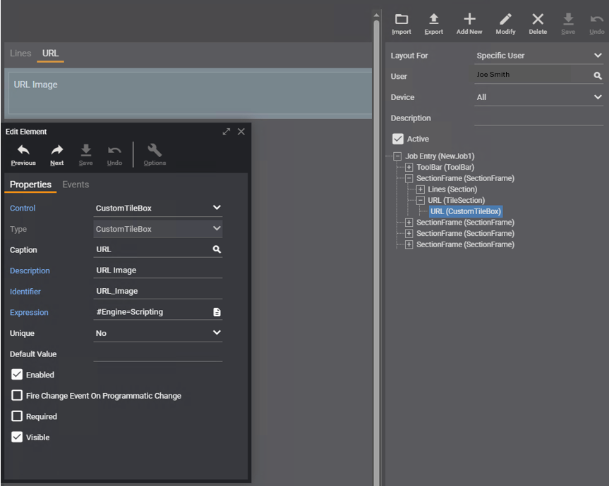
Edit Element details
|
Property |
Entry/Selection |
|---|---|
|
Control |
CustomTileBox |
|
Type |
CustomTileBox |
|
Caption |
URL |
|
Description |
URLImage |
|
Identifier |
URL_Image |
|
Expression |
#Engine=Scripting function lfUrl() { var loPayload = { "Filename": "https://canto-wp-media.s3.amazonaws.com/app/uploads/2019/08/19194138/image-url-3.jpg", "Content": "" }; return Convert.ToJSON(loPayload); } lfUrl(); |
|
Unique |
No |
|
Default Value |
leave blank |
|
Enabled |
checked |
|
Fire Change Event On Programmatic Change |
unchecked |
|
Required |
unchecked |
|
Visible |
checked |
Related Pages
- Configuring Form Layouts
- Scripting Library